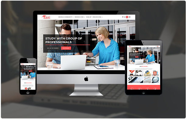
Edifi is a sleek and powerful responsive Moodle theme that provides all the tools you need to launch a successful online e-learning portal.
Features
This template has everything that you need to build a learning management system with Moodle. Check out some of features that we have in this template. To know more about features of Edifi, continue reading our documentation and check our available components.
- HTML5 & CSS3
- Built with Bootstrap 4
- SCSS files included
- 100% responsive design
- Cross browser compatibility
- RTL language support
- Homepage slider
- Homepage carousel
- Custom menus
- Different header styles
- Customizable footer widgets
- Social media icons in footer block
- Promo boxes on home page
- Predefined color schemes
- Predefined layouts for courses listing page
- Google fonts support
- One click DEMO data importer
- Background images included
- Well Documented
- Easy to customize
- Customizable login page
- Supports moodle front page items: list of courses, list of categories , announcements
- Customizable front page settings
- 4 header styles
- Customizable featured courses block in frontpage
- Student testimonials block in frontpage
- Our team/teachers block in frontpage
- Site preloader option
- Back to top option
- Supports Custom CSS
- Easy to use
- No coding knowledge required
- Very detailed online documentation
- Fully tested on multiple versions of moodle
- Frequent updates to support newer moodle versions
- Free future updates & new features
- Reliable support
Installation
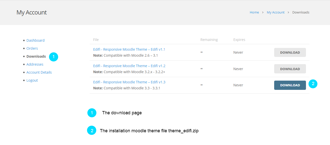
You can install the theme in two ways: through Moodle, or via FTP. The theme_edifi.zip file is the Installable Moodle Theme and what you need to use to get the theme installed. Please see the following sections for each method. But first, you need to download the Edifi files from your LMSACE account. Navigate to your downloads page on LMSACE and find Edifi theme with version. Click the download button to get Edifi installable theme file. See below.
For Moodle version 3.2.X please download Edifi version 1.3
Install Theme via FTP client
- Log into your server installation via FTP. You can use software such as Filezilla for this.
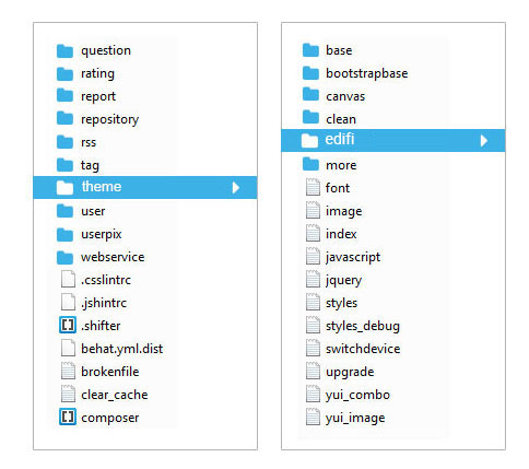
- Unzip the theme_edifi.zip file and ONLY use the extracted Edifi theme folder.
- Upload the extracted Edifi folder to the to the /theme folder of your Moodle installation.
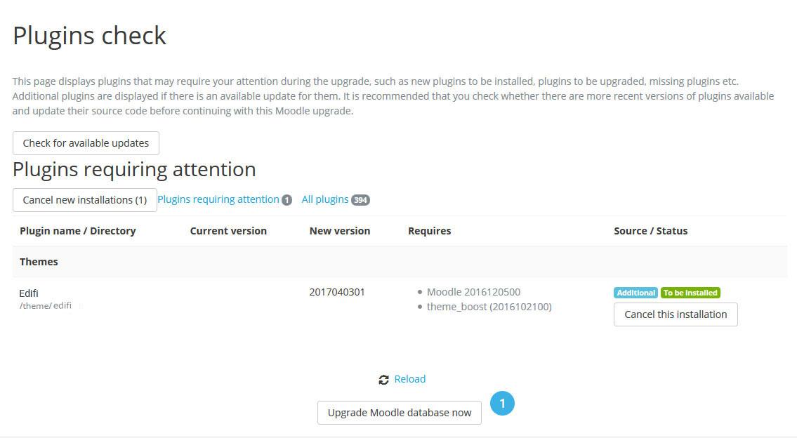
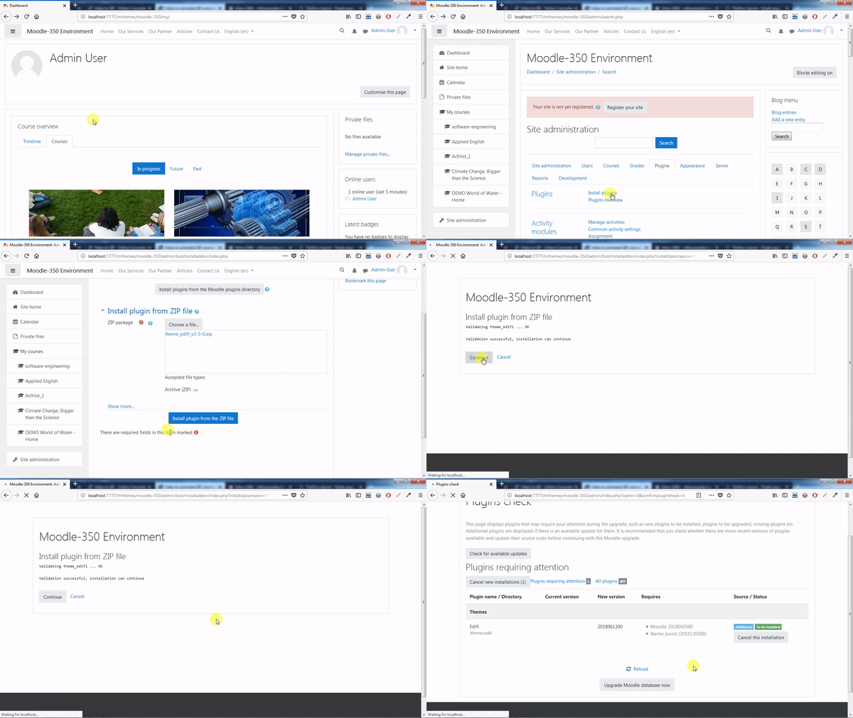
- Now login to your Moodle site as an admin and go to Site administration > Notifications, you will see a Notification for theme to be installed. Click "Upgrade Moodle Database now" button to continue for the installation procedure.
Install Theme via Moodle
- Login to your Moodle site as an admin and go to Site administration → Plugins → Install plugins
- Upload the theme_edifi.zip file. You could be prompted to add extra details (in the ‘Show more‘ section), if your plugin is not automatically detected.
- If your target directory is not writeable, you will see a warning message.
- Check the plugin validation report to find if the theme has been successfully installed.
Activating The Theme
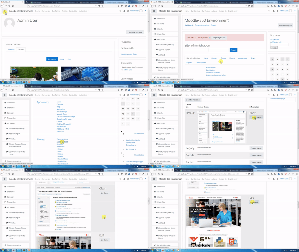
- Log in as admin and go to Site administration → Appearance → Themes → Theme Selector
- Click on "Clear theme caches" button
- Click on the "Select theme" button on the right of the current theme being
- Scroll down to find Edifi
- Click the "Use theme" button next to Edifi
- Moodle will tell you that the theme has been set as the default theme
- Check your Moodle site by going to the Moodle site’s home page
Import Edifi Demo
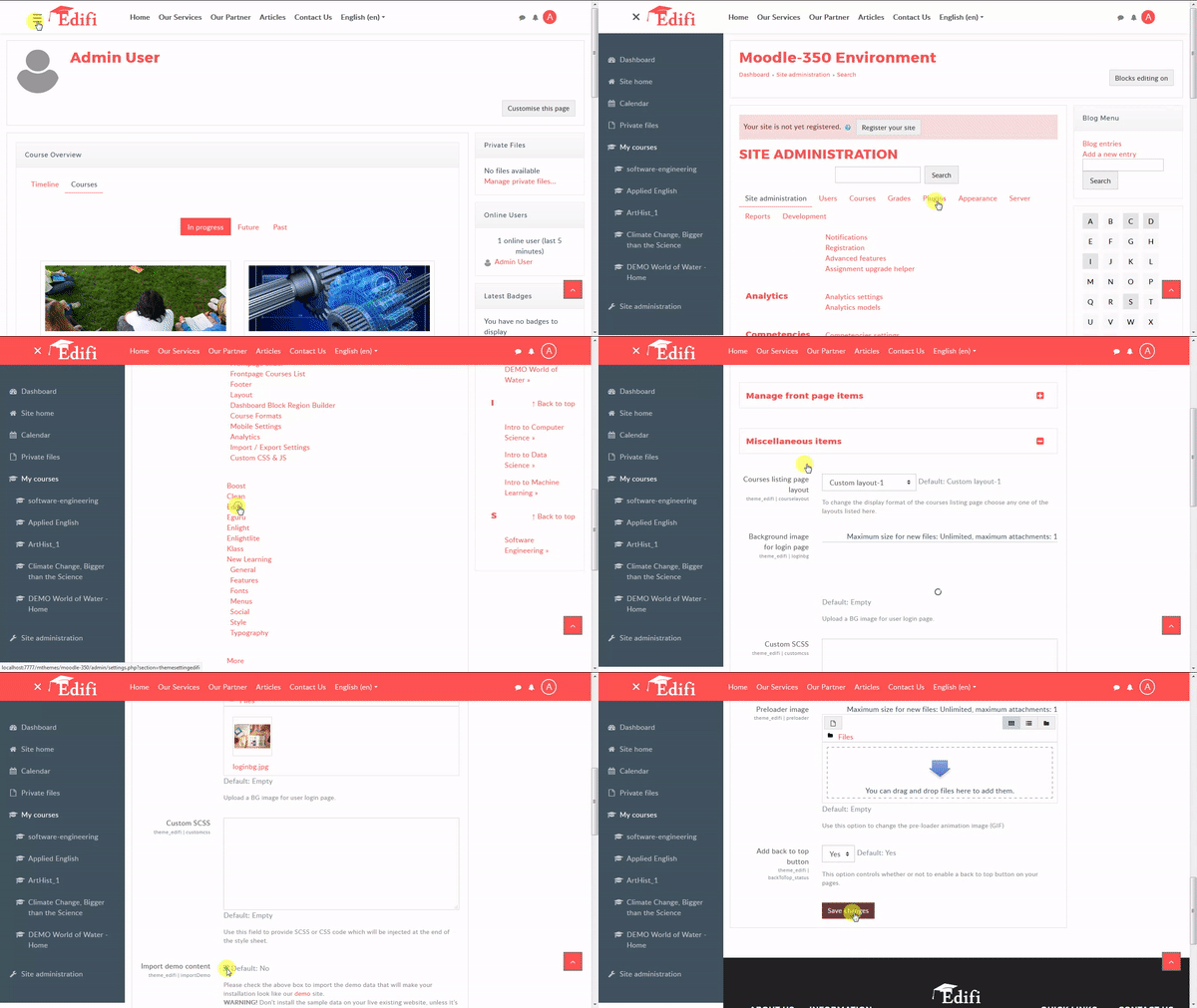
- Login to your Moodle site as an admin and go to Site administration → Appearance → Themes → Edifi
- Select General tab → "Miscellaneous Items" section
- Please check the import demo content checkbox to import the demo data that will make your installation look like our demo site.
- It can take a few minutes to import everything. Please be patient and wait for it to complete. Once it loads, you will see a success message.
Update Theme
Download the latest theme version and install the theme plugin in your moodle. Same process as the theme installation.
- Login to your Moodle site as an admin and go to Site administration → Plugins → Install plugins
- Upload the theme_edifi.zip file. You could be prompted to add extra details (in the ‘Show more‘ section), if your plugin is not automatically detected.
- If your target directory is not writeable, you will see a warning message.
- Check the plugin validation report to find if the theme has been successfully installed.
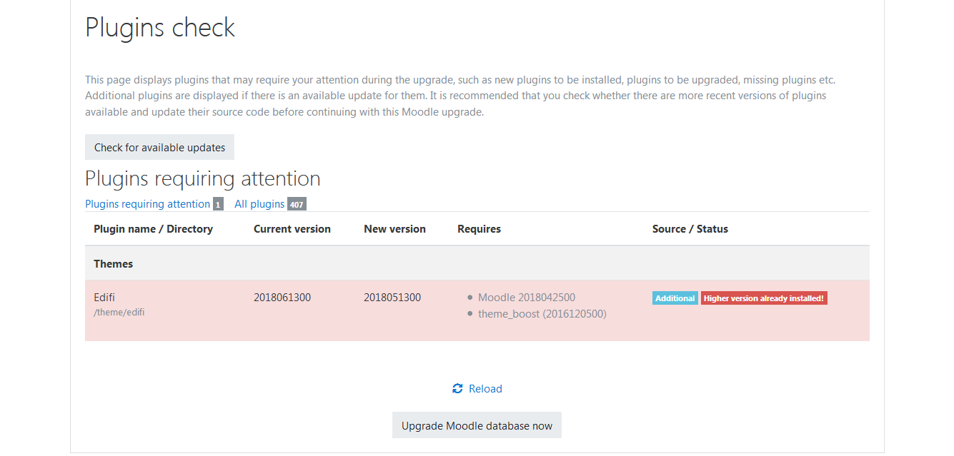
Validation Failure
If the validation error message occurs during installation or upgrading the theme, its because the theme is trying to install on the lower moodle version.

Upgradation Failure
If the upgradation error message occurs during upgrading the theme, its because the theme new version is incorrect from the current installed version.
Multi Language
The multi-language content filter enables resources to be created in multiple languages. When turned on, it looks for tags which indicate that a text contains multiple languages. Then it selects and outputs the text in the user's language
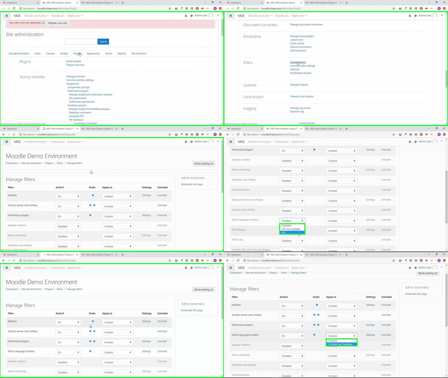
Enabling the multi-language content filter
An admin can enable the multi-language content filter as follows:
- Go to Site administration > Plugins > Filters > Manage filters and in the dropdown menu for multi-language content select 'On'.
- If headings are to be shown in multiple languages too, select 'Content and headings' in the 'Apply to' column. Note that this may affect site performance.
How to use
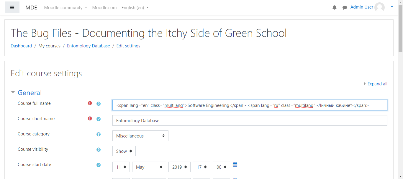
<"span lang="en" class="multilang"> "your_content_in_English"<"span lang="de" class="multilang"> "your_content_in_German_here"
Common problems
The multi-lang filter is not enabled. It can be enabled in 'Manage filters' in the Site administration'.
- Headings aren't displaying correctly - the multi-lang filter should be set to apply to content and headings in 'Manage filters' in the Site administration'.
- Extra characters between language span tags - editor might add
or other tags, please review the html in source view. - If the course setting is "force" some language, you won't be able to change the displayed language.
- Extra spaces in language span tag.
- The multi-lang filter does not work with the course short name! A course's short name is meant as a unique course identifier, so it does not use the multi-lang filter.
General
Color Schemes
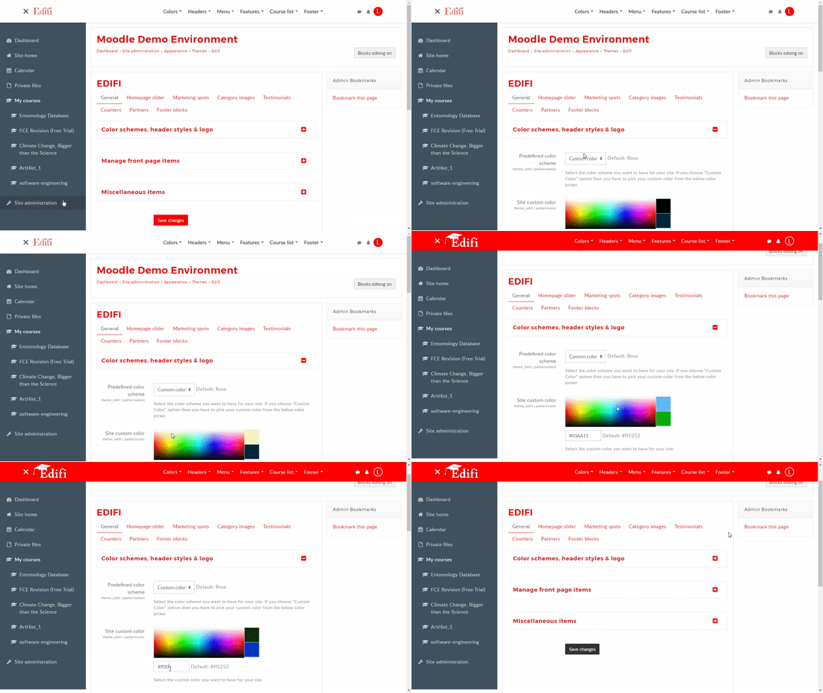
Select the color scheme from the color pattern to change your site color. And you can also change your site colors from the color picker in the Customize Design panel of several elements. Click any of the color to view the HEX color.
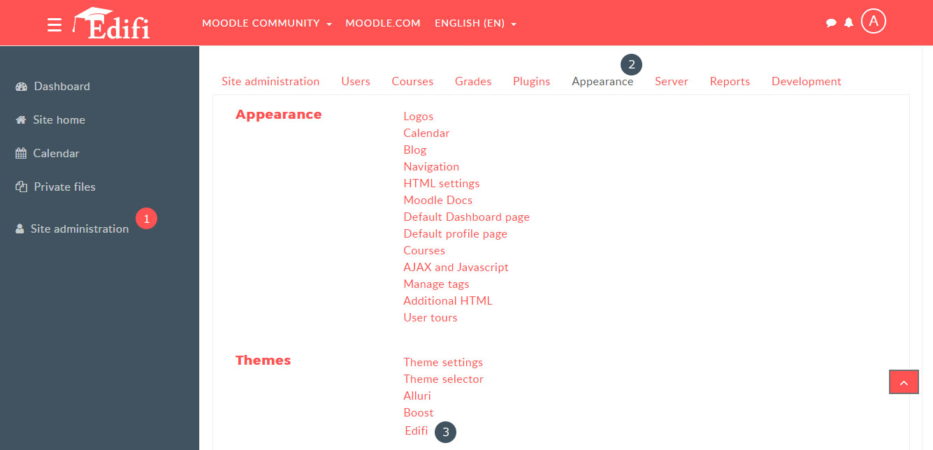
- Navigate to Site administration → Appearance → Themes → Edifi
- Select "General" tab → "Color schemes,header styles,logo" section
- You can select your theme color from the multi color choice in the Predefined color scheme option,
- If you want your own prefered color, Select the "custom color" from the Predefined color scheme option.
- Locate the "Site custom color " option and select the color from the color picker or type the hex value in the text box , then click the ‘Save changes’ button at the bottom
Header Styles
Edifi includes different Header styles to better fit the needs of your website(s).
- Navigate to Site administration → Appearance → Themes → Edifi
- Select "General" tab → "Color schemes,header styles,logo" section
- Locate the "Header Style" option and select your header style
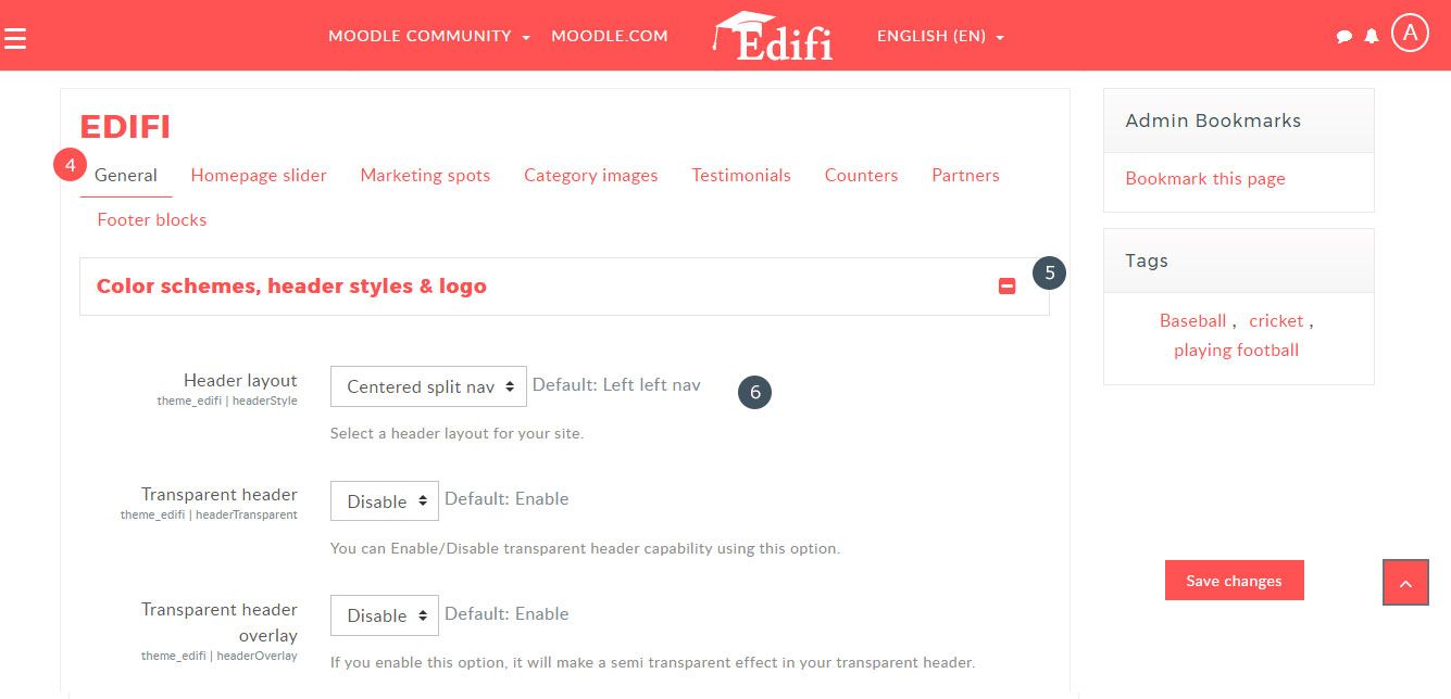
Header Style1
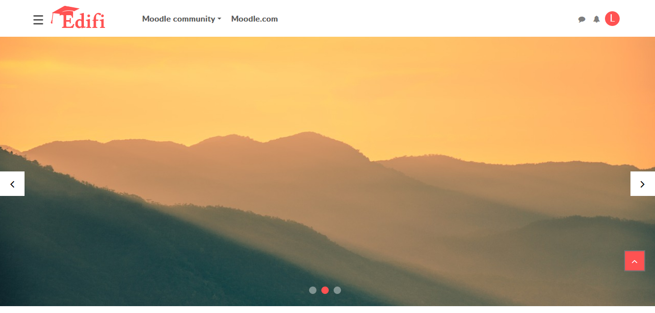
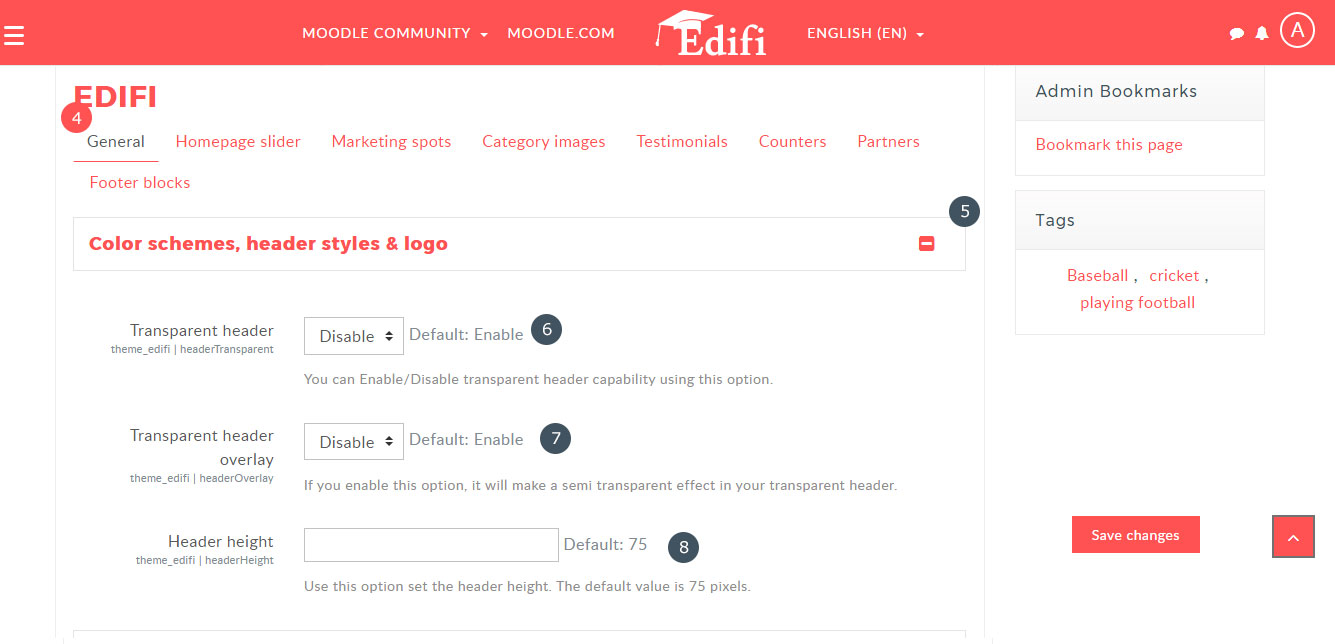
The default header style has the logo on the left and the navigation menu on the right. The "White" color as background for the header is default header by disabling the "Transparent header" and "Transparent header overlay" option.
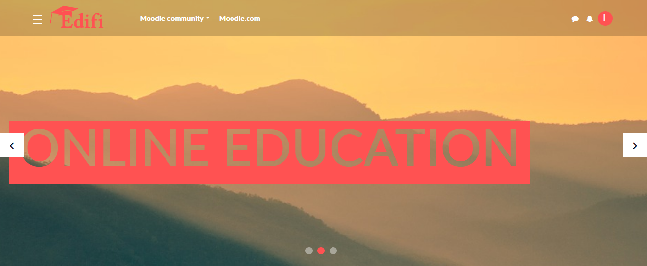
Header Style1
Enable the "Transparent header" option, for the "Transparent BG header".
Header Style3
Enable the "Transparent header" and "Transparent header overlay" option for the Semi Transparent BG header.
Sticky Header
"Sticky Header" has theme color as BG color will appear only when scrolling the page.

Logo
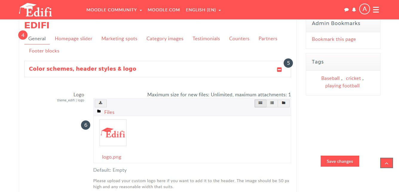
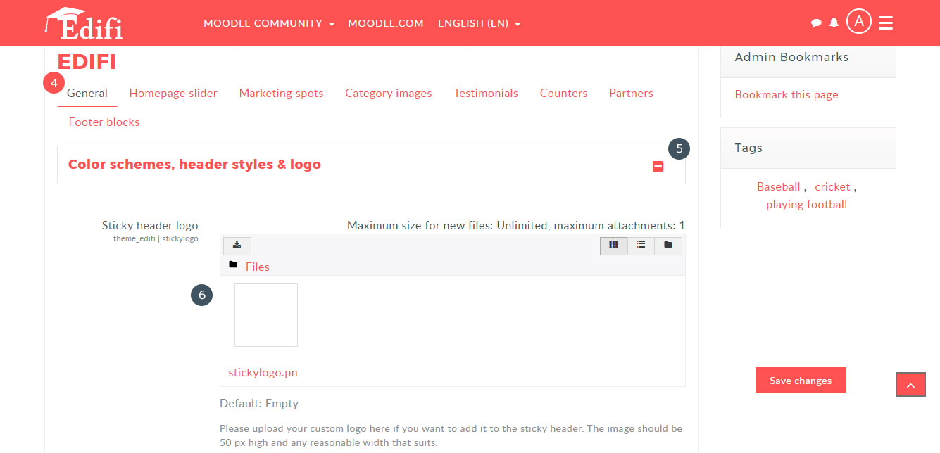
You can upload your custom logo and sticky logo here.
- Navigate to Site administration → Appearance → Themes → Edifi
- Select "General" tab → "color schemes,header styles,logo" section
- Locate the "Logo" option and upload your custom logo
- "Sticky header logo" option will be next to the "Logo" option and upload your custom logo for sticky header

Menus
Manage Primary Menus
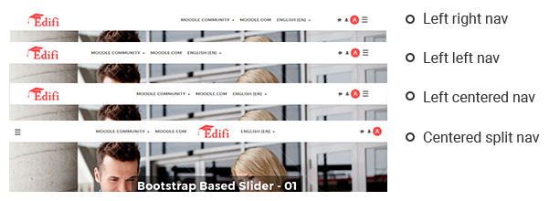
Primary Navigations are placed next to the site logo. Choose your header primary menu style:- Select the "Left Left nav" menu for logo at the left and primary menu on the left side on the header.
- Select the "Centered split nav" menu for logo at the center between the splited primary menu on the header.
- Select the "Left Right nav" menu for logo at the left and primary menu on the right side on the header.
- Select the "Left Centered nav" menu for logo at the left and primary menu on the center on the header.
- Navigate to Site administration → Appearance → Themes → Edifi
- Select "General" tab → "color schemes,header styles,logo" section
- Locate the "Primary menu items" option and configure the primary menus
Header Height
You can also increase the header height by adding the value in the text box. But the Sticky header will be default height.

Manage Custom Menu Items
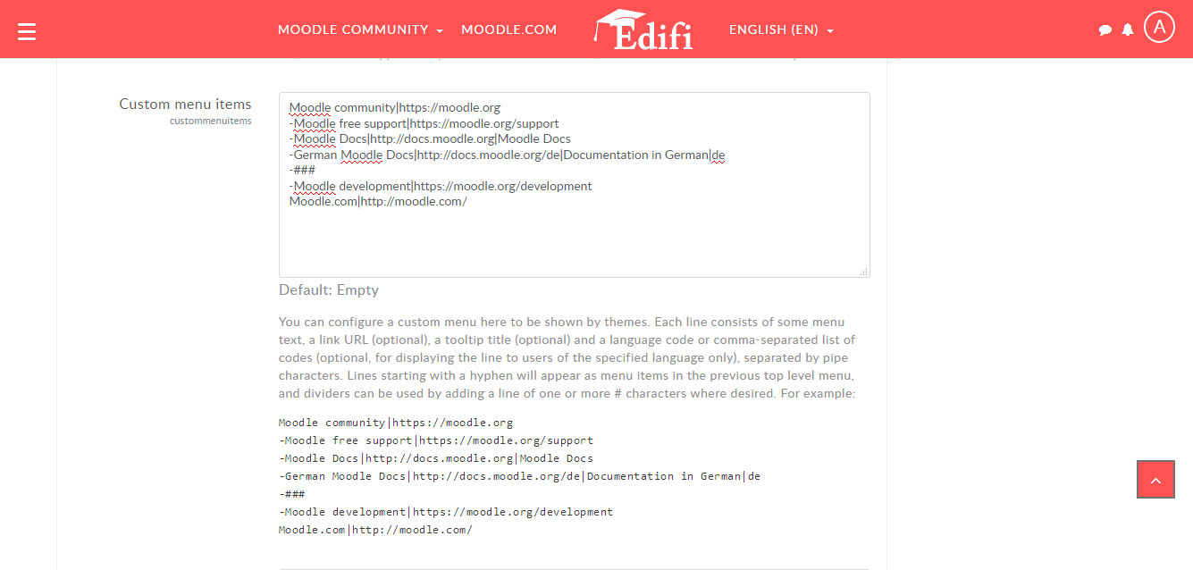
The custom menu, which appeared as the "primary menu" on the header with different styles. To manage custom menu links- Navigate to Site administration → Appearance → Themes → Theme Settings
- Locate the "Custom menu items" option and configure the custom menu items
Enable Courses Menu Items
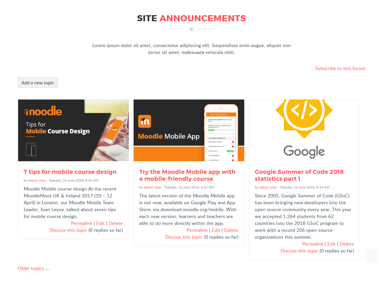
Manage front page items
- Navigate to Site administration → Appearance → Themes → Edifi
- Select "General" tab → "Manage front page items" section
You can change the style of the frontpage setting by customization of the "Manage front page items".
- Enter the "Course ID" to display the courses on the "Featured Courses" block.
- You can add the Title, Description for the Featured Course, Available Course, My Course, Course Categories, Combo List Course and Search block.
- Choose the block style as moodle default or Carousel for the front page default items in the settings.
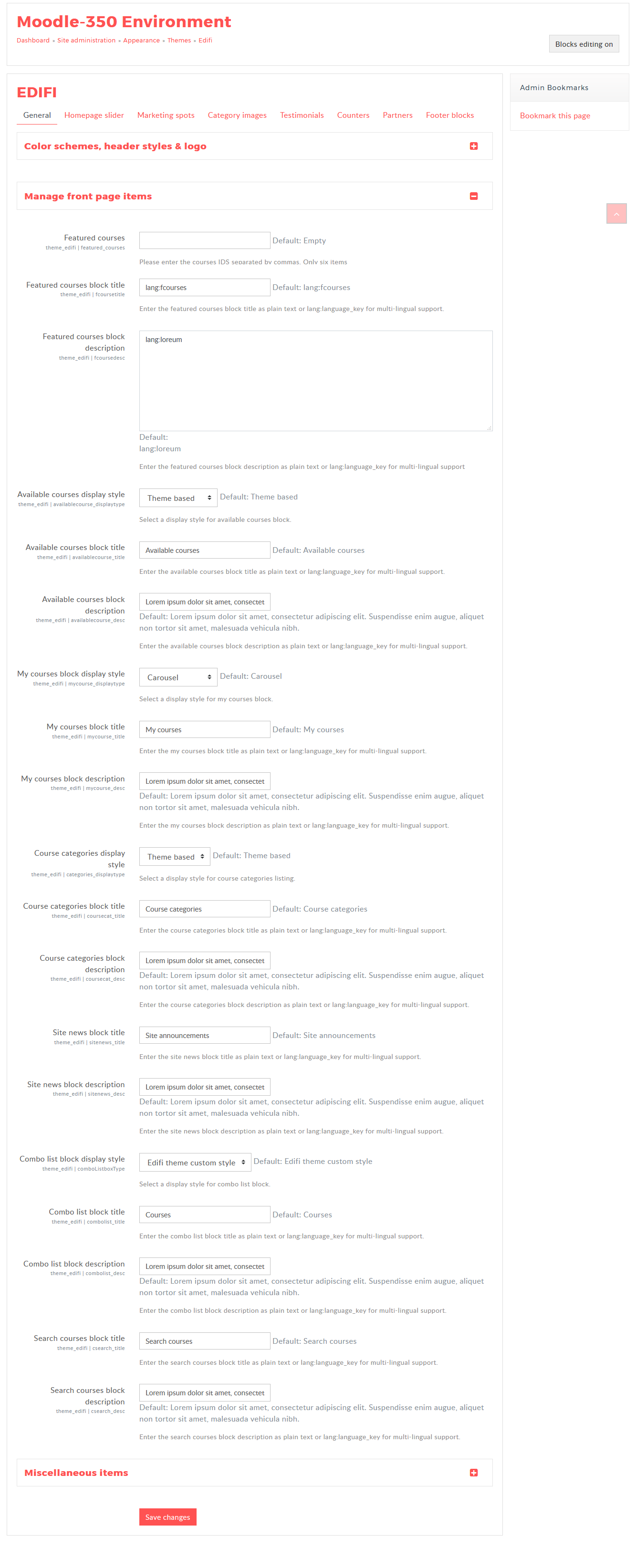
The Available courses as the carousel style and search block on the frontpage. All the courses will be shown in the slider list of the "Available courses" block.
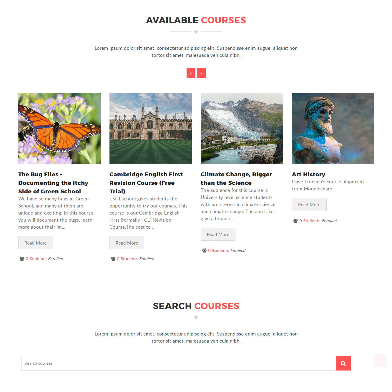
The Combo list courses as the carousel style on the frontpage. You can select the category and also the sub category on the "Select subcategory" select box.
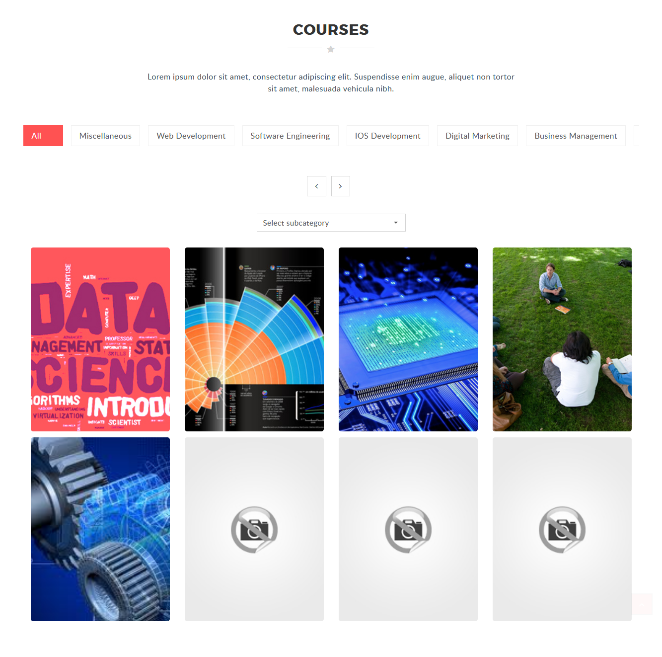
The Site news with the default style on the frontpage. You can add the site news by clicking the "Add a new topic" on the frontpage after logged in as "Administration".
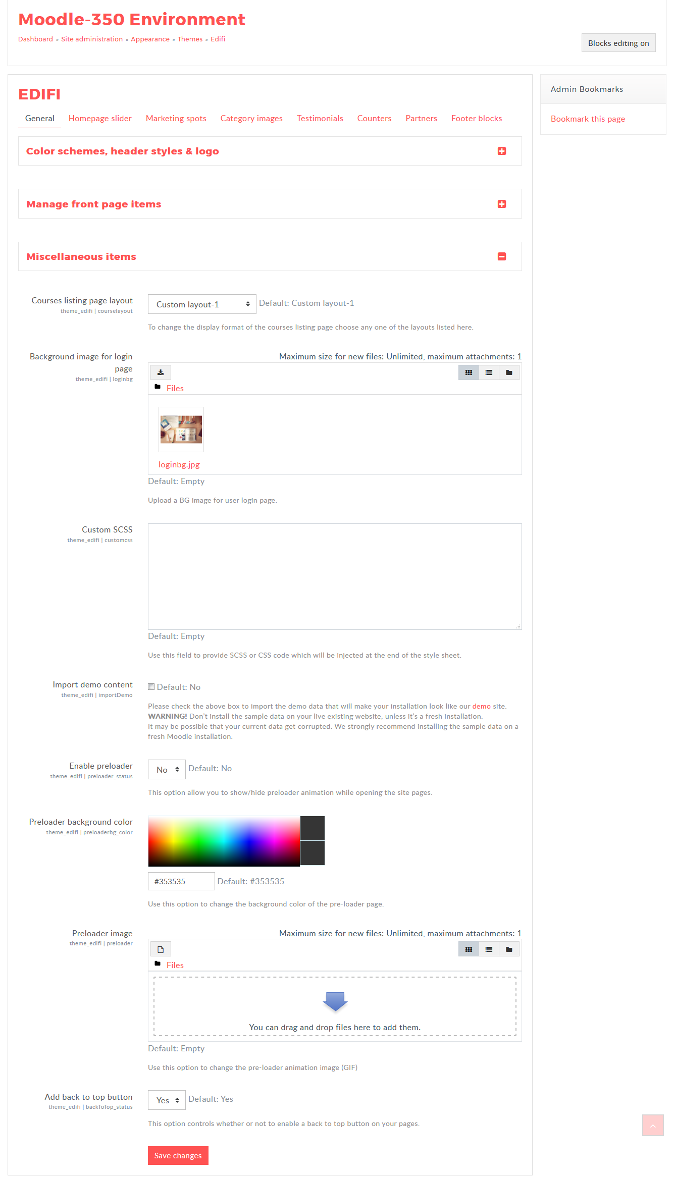
Miscellaneous items
- Navigate to Site administration → Appearance → Themes → Edifi
- Select "General" tab → "Miscellaneous items" section
In "Miscellaneous items"
- Courses listing page layout: To change the display format of the courses listing page choose the default or the custom layout.
- Background image for login page: Upload a background image for user login page.
- Custom SCSS: Use this field to provide SCSS or CSS code which will be injected at the end of the style sheet
- Import demo content: To import the content for your theme as the demo site.
- Enable preloader: This option allow you to show/hide preloader animation when the site pages are loading.
- Preloader background color:Select your prefered color for the pre-loader background color.
- Preloader image: Use this option to change the pre-loader animation image (GIF)
- Add back to top button: This option controls to enable a back to top button on your pages.
Homepage Slider
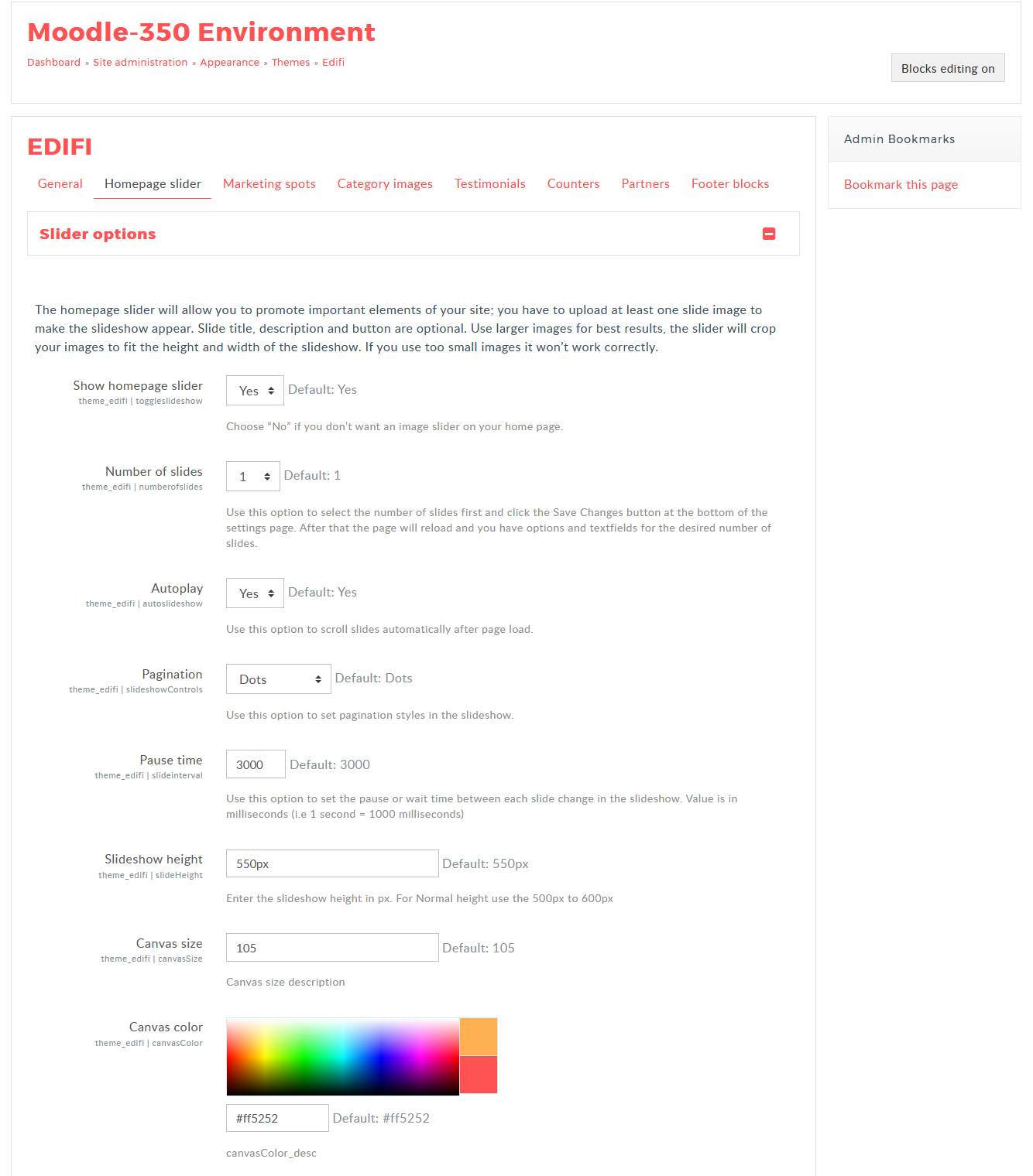
Homepage Slider is highly customizable and responsive swipe image slider carousel with content, links and slideshow effects. When cursor hover Slider, it will freeze and when the cursor is away from slider then it moves to the next slider.
- Navigate to Site administration → Appearance → Themes → Edifi
- Select "Homepage slider" tab → "Slider options" section
- The Homepage slider contains number of slider, Autoplay, pagination, pause time, Height and Canvas type options.
- Show homepage slider: You can show/hide the Homepage slider by selecting Yes/No from the select box.
- Number of slides: Use this option to select the number of slides. You can add upto maximum of 12 slides for the Homepage slider.
- Autoplay: Use this option to scroll slides automatically after page load by selecting yes in the select box.
- Pagination: You can set the pagination style with Dots or Thumbnails image for the slider.
- Pause time: Use this option to set the pause or wait time between each slide change in the slideshow.
- Slideshow height: You can set value for the slider height in the text box.
- Canvas size: Use this option to set the canvas size.
- Canvas color: Select your prefered color fron the color picker for your canvas content.
Slideshow option:
- Navigate to Site administration → Appearance → Themes → Edifi
- Select "Homepage slider" tab → "Slide 1 options" section
- Status: The slide has the option to show or hide the respective slideshow.
- Slide type: Select whether you need the image or video slide for the slideshow.
- Slide image: Upload the image for the respective slide, add the recommended image size.
- Slide video URL: If you have selected the self-hosted video in the "Slide type", then add the video URL here.
- Video preview image: Upload the image, which will appear while the video is loading for the video slide.
- Mute audio: Select Yes/No to mute audio for the video slide.
- Slide title and description: Add the title and the description for the slide.
- Button 1 text, URL, target: Add the text, URL for the slide and select the target whether the link should be open in the "Same/New" window.
- Content style: You can choose the content/canvas style from the style option.
- Content width: Use this option to set the width for the content. This width will be calculated as a percentage of main grid width. Default value for this option is 50%.
- Content position: Use this option to set the location of the slide content and button in the slide.
- Content color: Use this option to set the color of slide contents (ie Slide title, Slide description and buttons).
- Slide title,description and button animation: Select the animation style for the slide content top appear on the slideshow.
- Slide animation: Use this option for the transition animation type of the slide, move to the next slide.
- Zoom slide image: Use this option for the image slideshow displaying images with zooming effect
- Overlay type: Select whether you need the background overlay for the content or full slide.
- Overlay color: Use this option to set a color for overlay on the slide. With this you will guarantee the readability of slide textual content.
- Overlay opacity: Use this option to set the opacity level of the overlay color. The default value for this option is 0.4.
- Click the "Save changes" button to save the customized option to apply for the slide.

Marketing Spots
News & Events block
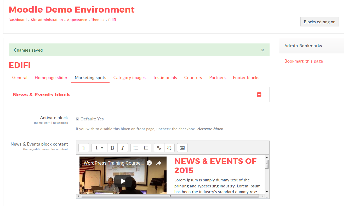
- Navigate to Site administration → Appearance → Themes → Edifi
- Select "Marketing spot" tab → "News & Events block" section
- Acitvate block: Select the checkbox to enable the "News & Events block"
- News & Events block content: Whatever you add to this textarea will be displayed in the "News & events block in front page".
After finishing site featured block customization block will be like this:

Site Featured Block
Getting a message to your target audience that is exactly what you want to say, exactly how you want to say it!
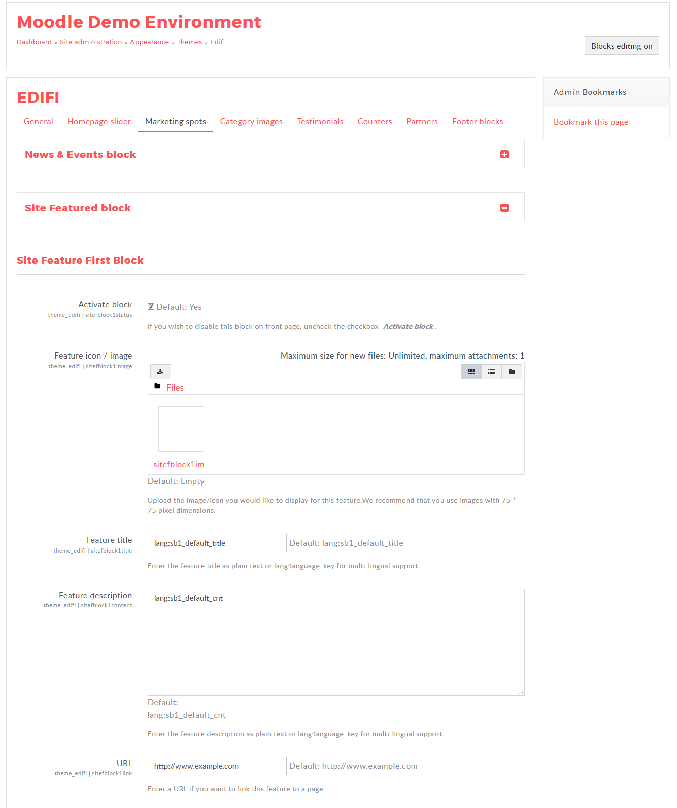
- Navigate to Site administration → Appearance → Themes → Edifi
- Select "Marketing spot" tab → "Site Featured Block" section
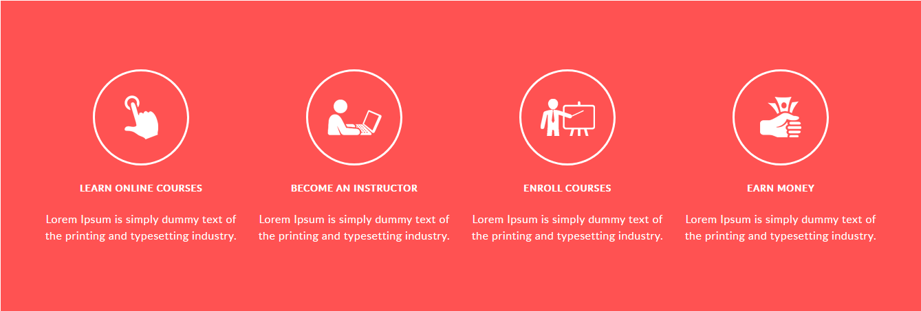
- The demo site of Theme Edifi contains a row of four icon boxes on the frontpage below the "Featured Courses". They also contain Image, Title, Description and links, for example to refer to another page.
- In the Site Featured First block, Enable the checkbox for the Activate block to Activate the "Site Featured First Block".
- Add image or the icon in the File picker, then add Title, Description in the textbox and the URL, if you want to link this feature to a page.
- Follow the same process to activate the other site featured block and Click "Save Changes"
After finishing site featured block customization block will be like this:
Category Images
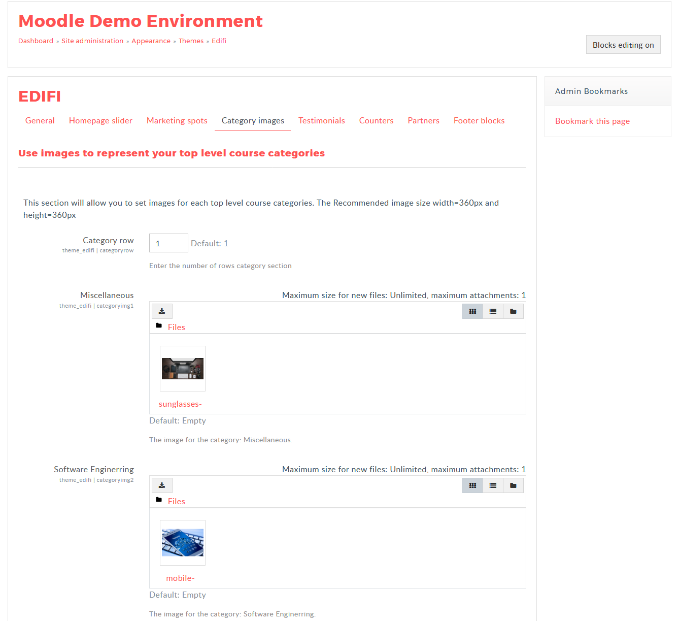
You can represent the categories by adding the images for the category in the back-end setting. Follow the instruction to add the images for the categories.
- Navigate to Site administration → Appearance → Themes → Edifi
- Locate the "Category images" option and upload the image for the categories
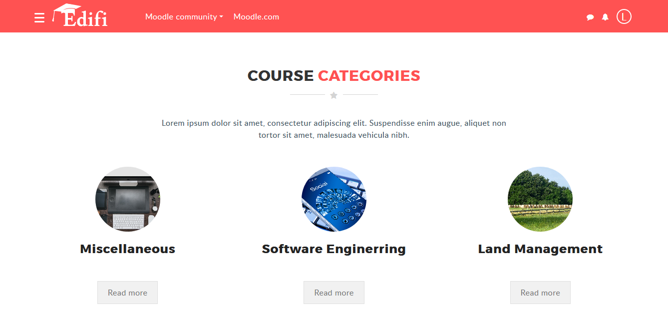
After adding the images to the catergories the category block will be like this:
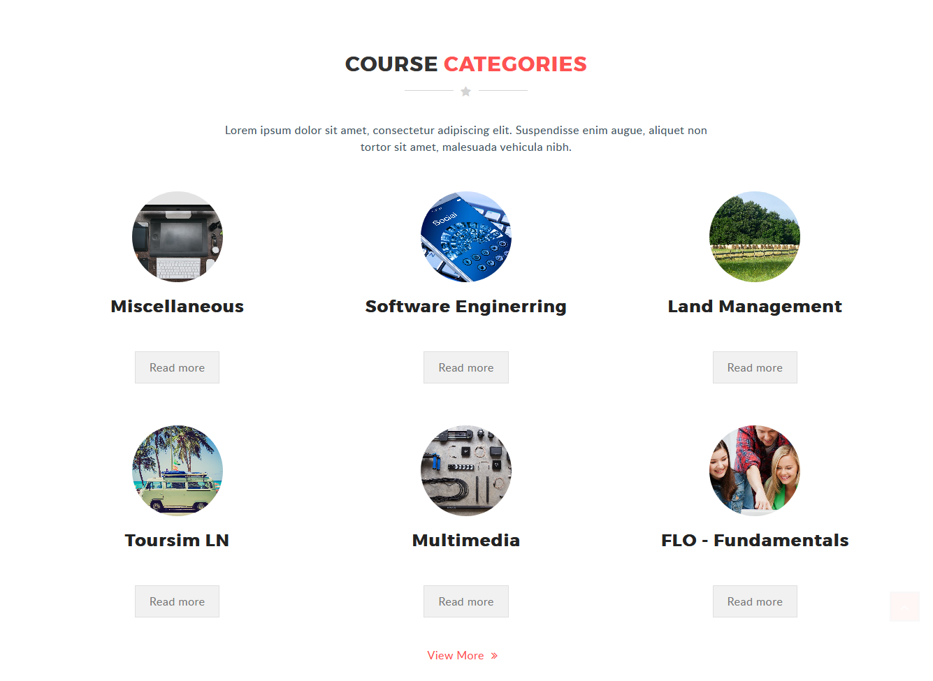
As the Category row value changes in the setting, the category block row will increases on the frontpage as shown on the image below
Testimonials
You can show the users review by the testimonial block.
- Navigate to Site administration → Appearance → Themes → Edifi
- Locate the "Testimonials" option and "Testimonials general settings".
- You have to Activate the testimonial block by enabling the checkbox, to display the testimonials on the frontpage.
- You can add upto 16 testimonials by selecting the value on the "Number of testimonials" select box.
- Select whether the testimonial should autoplay by selecting the "Autoplay" option.
- Also Add the Auto play time interval, Title and Description for the Testimonial block.
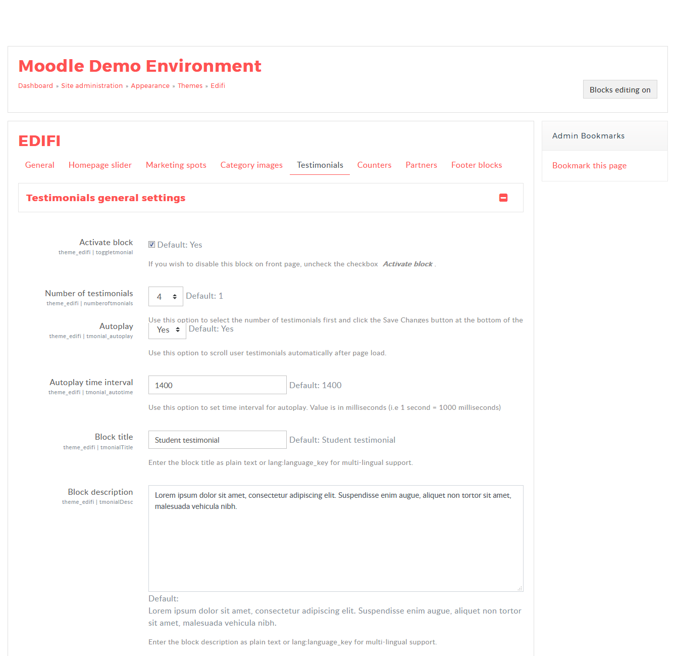
Add the User name, User role, image and content for the testimonial blocks.
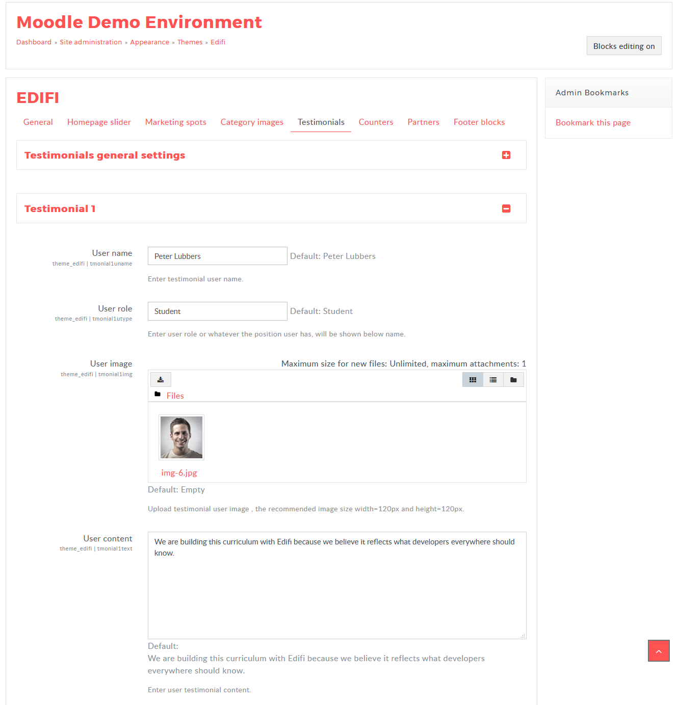
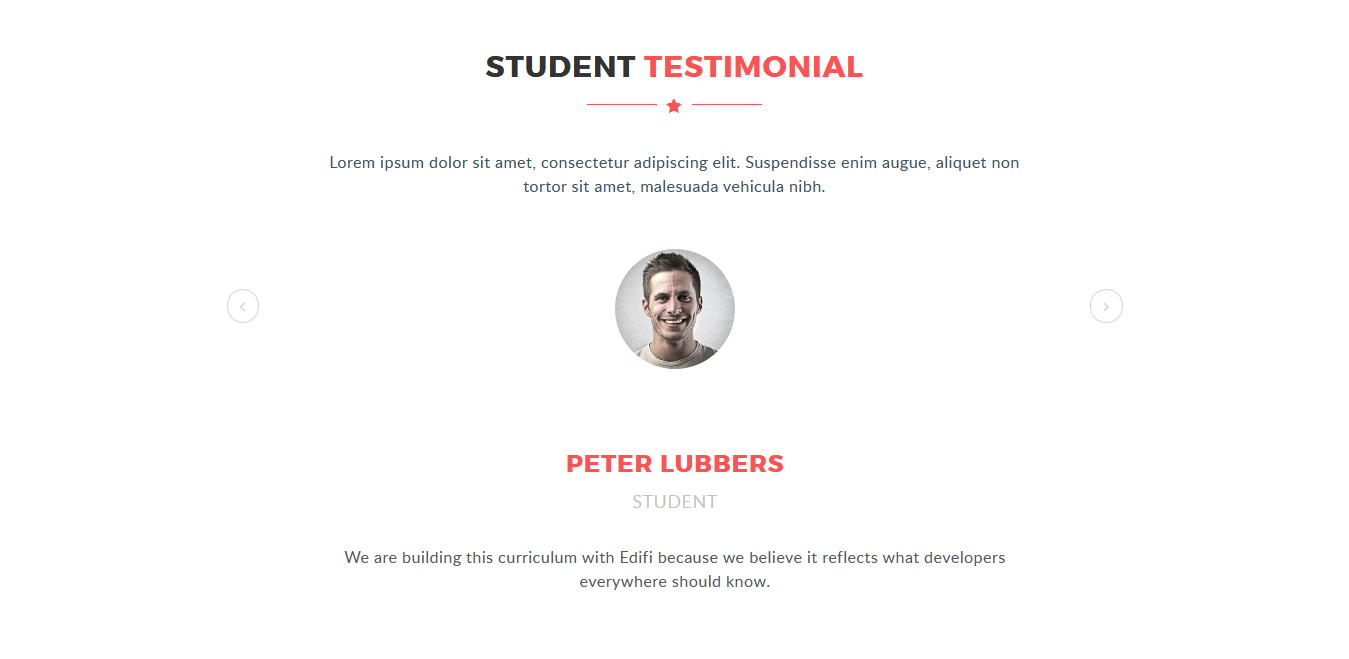
After adding the content on the testimonial block setting, you will get the result in the front page as the below image
Counter Block
You can show the counters in the counter block.
- Navigate to Site administration → Appearance → Themes → Edifi
- Locate the "Counters" option and "Counters general settings".
- You have to "Activate" the Counter block by enabling the checkbox, to display the Counters on the frontpage.
- Add the Title, Description for the Testimonial block.
- Uploading the image for "Block background image" will be the background image for the counters block.
- You can Enable the "Parallax Effect" for the Counters block.
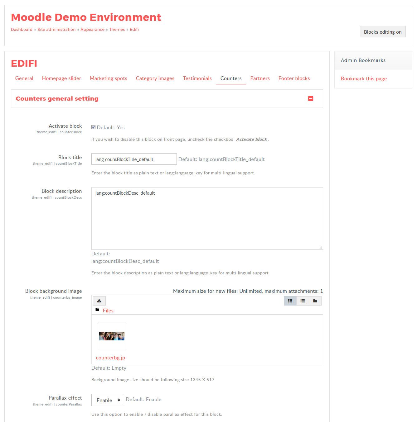
Add the User name, User role, image and content for the counter blocks.
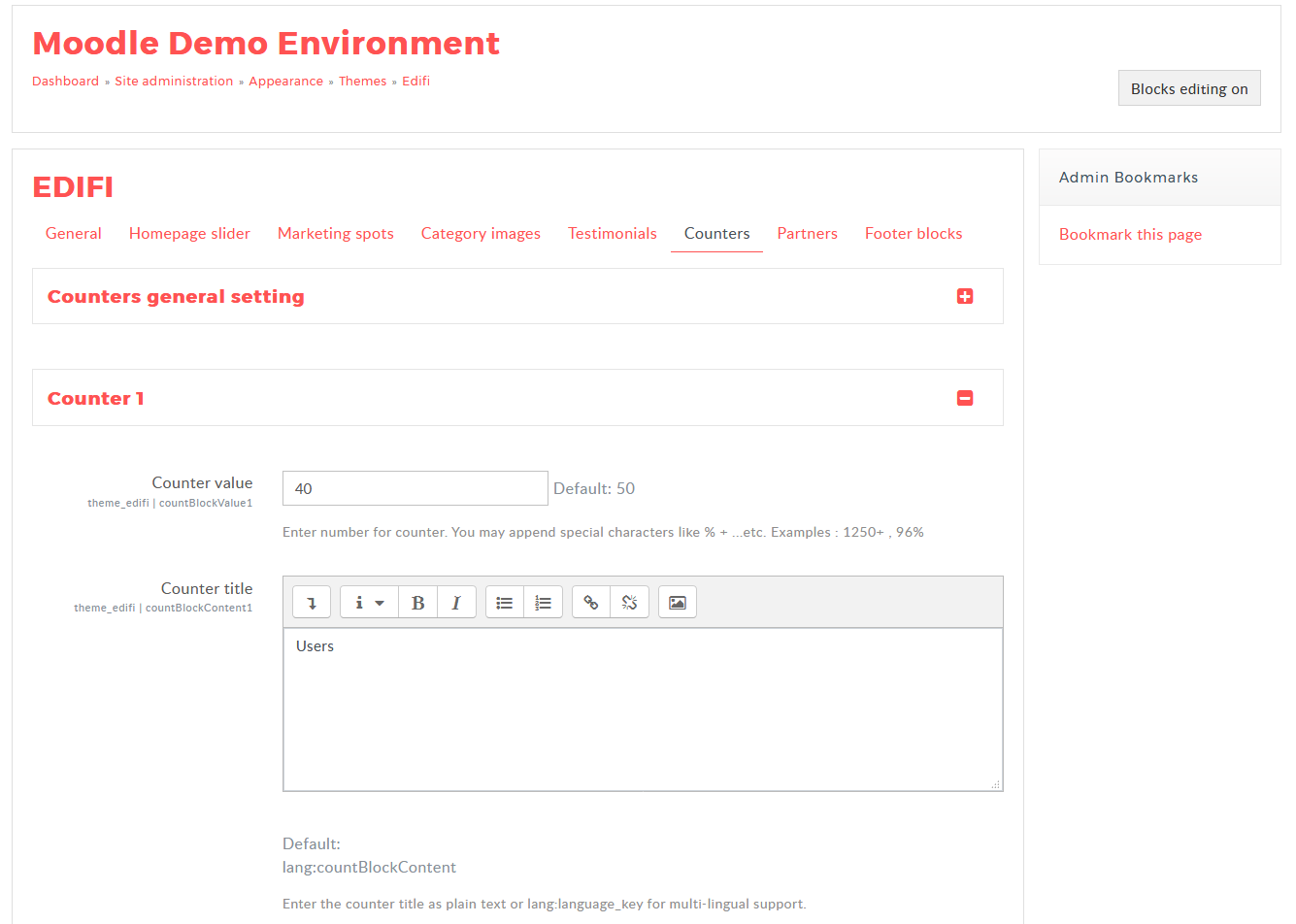
After adding the content on the Counter block setting, you will get the result in the front page as the below image

Our Partners
You can view the users review by the Partner block.
- Navigate to Site administration → Appearance → Themes → Edifi
- Locate the "Partners" option and "Partners general settings".
- You have to Activate the Partners block by enabling the checkbox, to display the testimonials on the frontpage.
- You can add unlimited number of partners by adding the value on the "Number of Partners to show" text box.
- Select whether the Partners should autoplay by selecting the "Autoplay" option.
- Also Add the Auto play time interval, Title and Description for the Partners block.
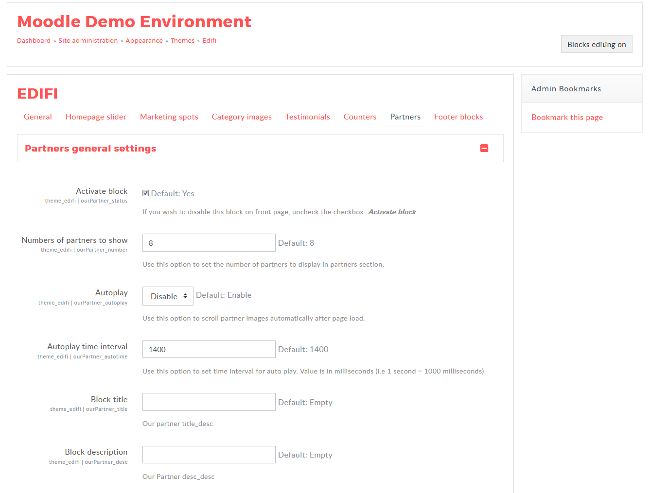
Parenters Block
Add the Title, logo, URL for the Partners blocks.
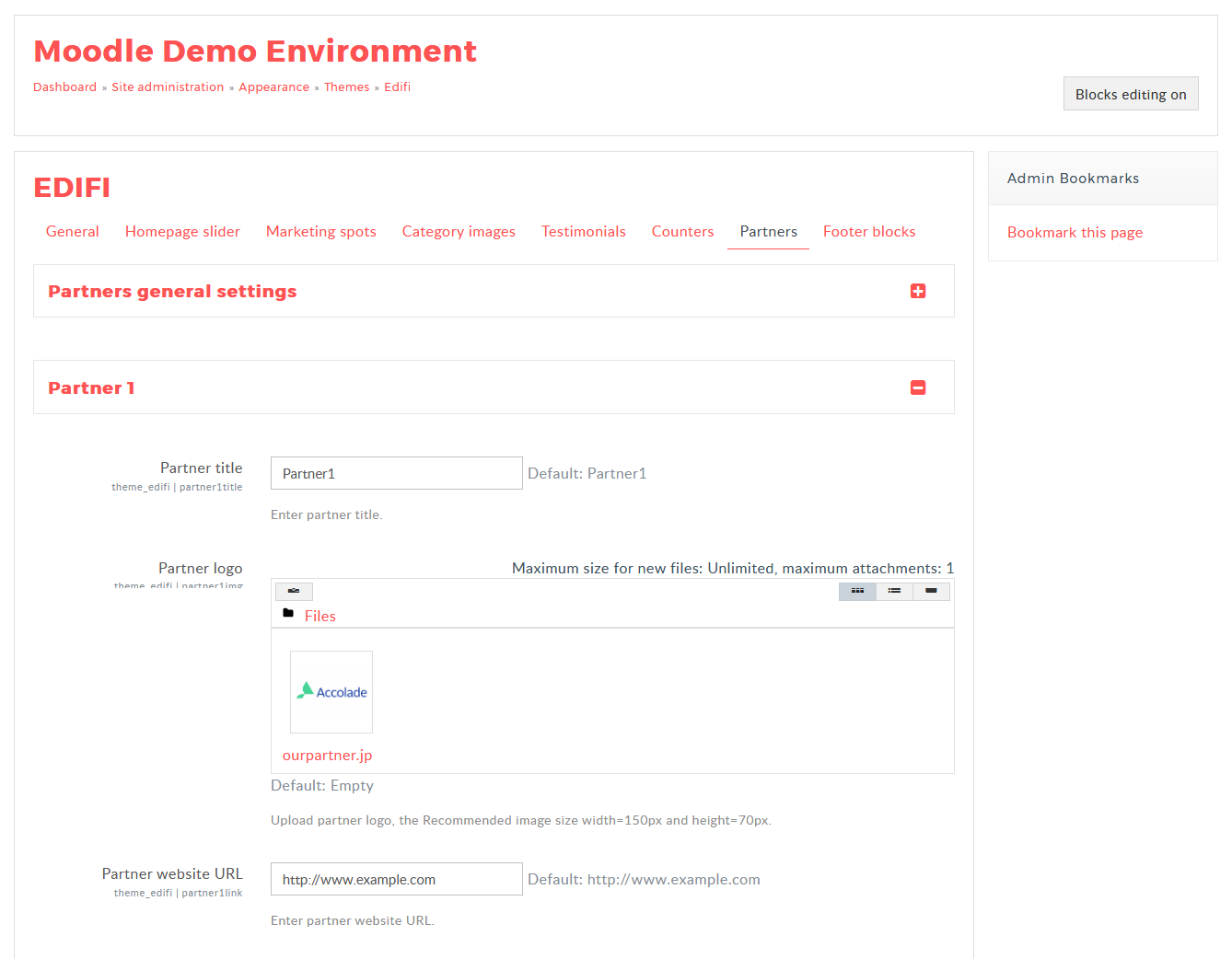
After adding the content on the Partners block setting, you will get the result in the front page as the below image

Footer Blocks
Getting a message to your target audience that is exactly what you want to say, exactly how you want to say it!
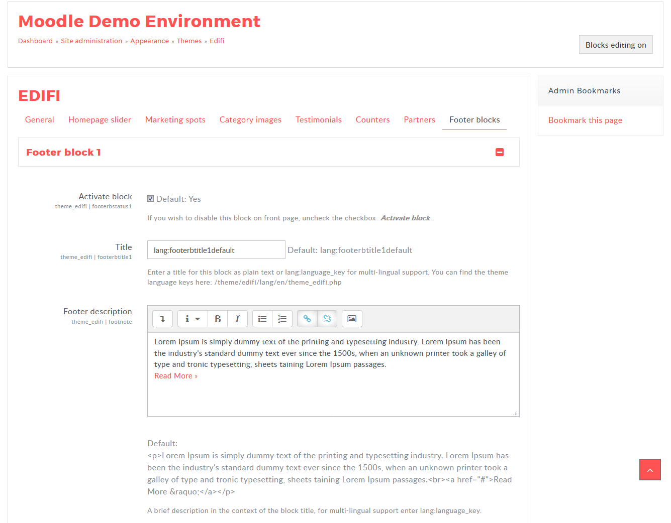
- Navigate to Site administration → Appearance → Themes → Edifi
- Select "Footer" tab → "Footer Block 1" section
- Activate block: Select the checkbox to activate the respective footer block.
- Title: Enter a title for the respective block as plain text or use "Block Title""Block Title" for the multi lang support
- Footer description: Enter the any text or html content inside the Text editor block for the footer description or use "Block Title""Block Title" for the multi lang support.
- Add image or the icon in the File picker, Title, Description in the textbox and the URL to refer to another page
- Follow the same process to activate the other site featured block and Click "Save Changes"

Footer Center Block
- Navigate to Site administration → Appearance → Themes → Edifi
- Select "Footer" tab → "Footer Center Block" section
- Footer logo: Upload the logo to display at the footer center block.
- Address: Enter the address in the text editor to know about your the location.
- Email/Phone no: Enter the Email and phone.no in the text box for the more information to contact.
Copyright & social media informations
- Navigate to Site administration → Appearance → Themes → Edifi
- Select "Footer" tab → "Change copyright & social media informations" section
- Social media icon/URL: Enter the social media icon and URL name in the text box which is used to follow you on the social network. You can add four social icons which will display at the bottom of the footer.
- Copyright content: Enter the Copyright content in the text box to display at the footer bottom.
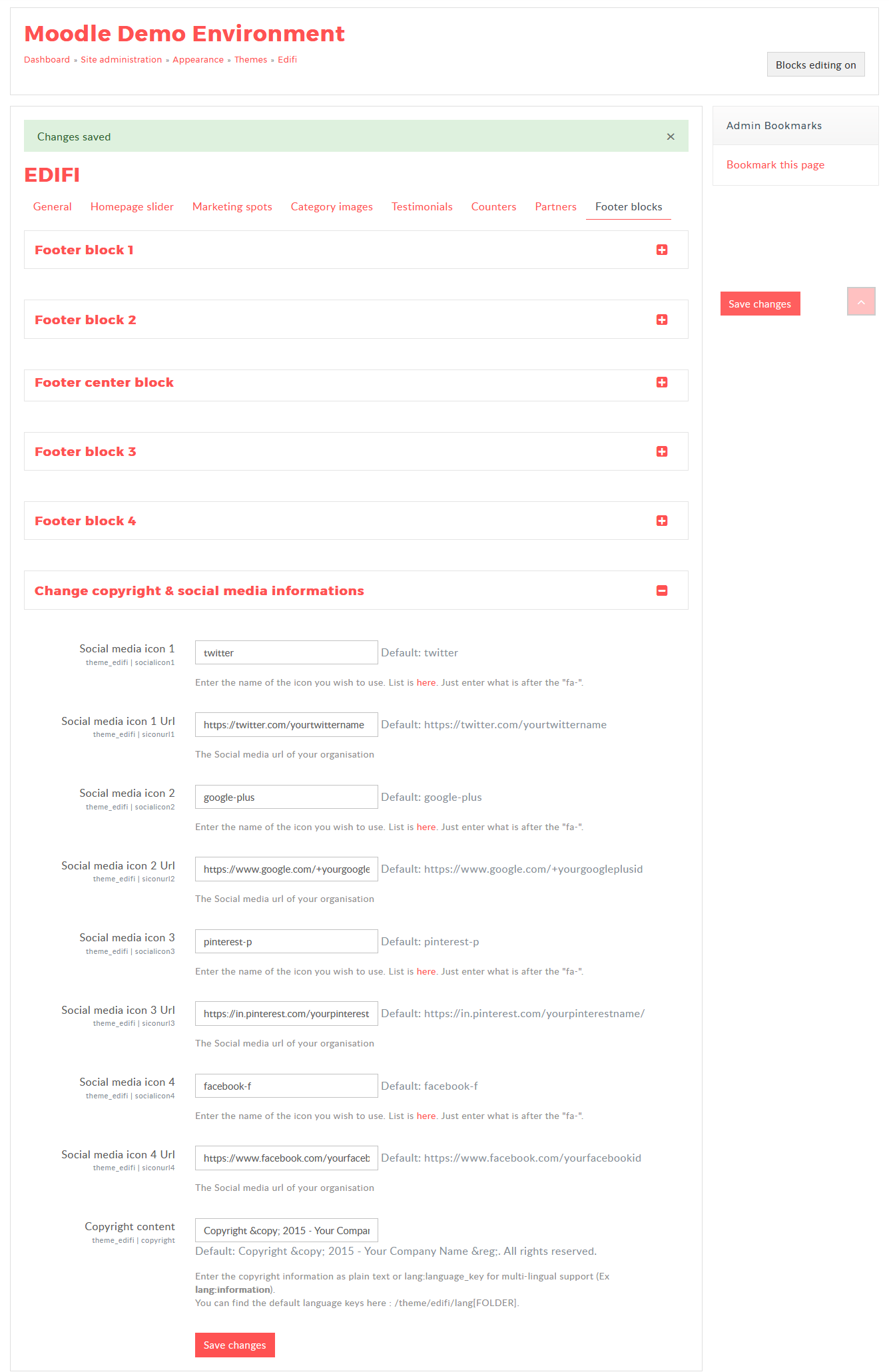
Different appearance when the footer blocks are disable:
All blocks are Enabled:
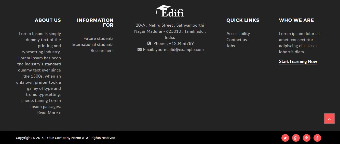
One block Disabled:

Two blocks Disabled:

Center block Disabled:

Integer egestas ante id justo mollis feugiat ac vel metus. Nunc pulvinar scelerisque faucibus. Aenean at libero hendrerit, feugiat felis suscipit, facilisis justo. Praesent laoreet rutrum velit vitae facilisis. Fusce ac consectetur leo. Praesent dapibus interdum arcu, et hendrerit mi imperdiet eget. Morbi volutpat, leo id interdum aliquet, massa justo vestibulum nisl, eget posuere velit diam ac nibh. Duis tellus enim, porttitor id lectus vitae, tristique congue odio. Duis elementum porttitor nibh et porta. Suspendisse potenti.
Ut vitae sagittis ex. In porttitor ante in nunc ultrices malesuada. Praesent iaculis odio vitae volutpat tempus. Nullam a sodales lorem, nec pellentesque odio. Praesent ullamcorper nisl commodo justo imperdiet dignissim. Duis purus magna, congue sit amet varius condimentum, dapibus tristique urna. Aliquam congue molestie tempor. Curabitur vel arcu vel nibh euismod porttitor. Sed a dolor maximus ex tempus pharetra rhoncus et nulla. Integer dolor ex, lobortis ac leo non, dapibus cursus ligula. Fusce sed ultrices urna, vel tincidunt mi. Nullam neque dolor, tempor nec lorem vitae, scelerisque consectetur quam.
Typography
Typography is the art and technique of arranging type to make written language readable and appearance on your site. A text stays the same no matter how it's rendered. Use typefaces and web fonts more creatively with our expert-taught typography.
Headings
A title at the head of a page or section with h1 tag through h6 tag, are available with different font styling.
h1. theDocs heading
h2. theDocs heading
h3. theDocs heading
h4. theDocs heading
h5. theDocs heading
h6. theDocs heading
Integer egestas ante id justo mollis feugiat ac vel metus. Nunc pulvinar scelerisque faucibus. Aenean at libero hendrerit, feugiat felis suscipit, facilisis justo. Praesent laoreet rutrum velit vitae facilisis.
          <div class="typo-block">
          <h1>h1. theDocs heading</h1>
          <h2>h2. theDocs heading</h2>
          <h2 class="title-headings"><b>Docs</b> heading<span><i class="fa fa-star"></i></span></h2>
          <h3>h3. theDocs heading</h3>
          <h4>h4. theDocs heading</h4>
          <h5>h5. theDocs heading</h5>
          <h6>h6. theDocs heading</h6>
          <p> Integer egestas ante id justo mollis feugiat ac vel metus. Nunc pulvinar scelerisque faucibus. Aenean at libero hendrerit, feugiat felis suscipit, facilisis justo. Praesent laoreet rutrum velit vitae facilisis. </p>
          </div>
Tabs
Add quick, dynamic tab functionality to transition through panes of local content.
Text tabs
Tabs are perfect for single page web applications, or for web pages capable of displaying different subjects.
But I must explain to you how all this mistaken idea of denouncing pleasure and praising pain was born and I will give you a complete account of the system, and expound the actual teachings of the great explorer of the truth, the master-builder of human happiness.
No one rejects, dislikes, or avoids pleasure itself, because it is pleasure, but because those who do not know how to pursue pleasure rationally encounter consequences that are extremely painful.
Nor again is there anyone who loves or pursues or desires to obtain pain of itself, because it is pain, but because occasionally circumstances occur in which toil and pain can procure him some great pleasure. To take a trivial example, which of us ever undertakes laborious physical exercise, except to obtain some advantage from it?
On the other hand, we denounce with righteous indignation and dislike men who are so beguiled and demoralized by the charms of pleasure of the moment, so blinded by desire, that they cannot foresee the pain and trouble that are bound to ensue; and equal blame belongs to those who fail in their duty through weakness of will, which is the same as saying through shrinking from toil and pain. These cases are perfectly simple and easy to distinguish.
<div class="tab-block">
<div class="tabs tabs-text">

  <!-- Nav tabs -->
  <ul class="nav nav-tabs" role="tablist">
    <li role="presentation">
      <a href="#home1" class="active" aria-controls="home" role="tab" data-toggle="tab">Home</a>
    </li>
    <li role="presentation">
      <a href="#profile1" aria-controls="profile" role="tab" data-toggle="tab">Profile</a>
    </li>
    <li role="presentation">
      <a href="#messages1" aria-controls="messages" role="tab" data-toggle="tab">Messages</a>
    </li>
    <li role="presentation">
      <a href="#settings1" aria-controls="settings" role="tab" data-toggle="tab"><i class="fa fa-cogs"></i> Settings</a>
    </li>
  </ul>

  <!-- Tab panes -->
  <div class="tab-content">
    <div role="tabpanel" class="tab-pane active fade in" id="home1">Lorem Ipsum is simply dummy text of the printing and typesetting industry. Lorem Ipsum has been the industry's standard dummy text ever since the 1500s, when an unknown printer took a galley of type and scrambled it to make a type specimen book.</div>
    <div role="tabpanel" class="tab-pane fade" id="profile1">Lorem Ipsum is simply dummy text of the printing and typesetting industry. Lorem Ipsum has been the industry's standard dummy text ever since the 1500s, when an unknown printer took a galley of type and scrambled it to make a type specimen book.</div>
    <div role="tabpanel" class="tab-pane fade" id="messages1">Lorem Ipsum is simply dummy text of the printing and typesetting industry. Lorem Ipsum has been the industry's standard dummy text ever since the 1500s, when an unknown printer took a galley of type and scrambled it to make a type specimen book.</div>
    <div role="tabpanel" class="tab-pane fade" id="settings1">Lorem Ipsum is simply dummy text of the printing and typesetting industry. Lorem Ipsum has been the industry's standard dummy text ever since the 1500s, when an unknown printer took a galley of type and scrambled it to make a type specimen book.</div>
  </div>
</div>
</div>
Alignment
Add .text-center or .text-right to the ul.nav to change the position of tabs.
But I must explain to you how all this mistaken idea of denouncing pleasure and praising pain was born and I will give you a complete account of the system, and expound the actual teachings of the great explorer of the truth, the master-builder of human happiness.
No one rejects, dislikes, or avoids pleasure itself, because it is pleasure, but because those who do not know how to pursue pleasure rationally encounter consequences that are extremely painful.
Nor again is there anyone who loves or pursues or desires to obtain pain of itself, because it is pain, but because occasionally circumstances occur in which toil and pain can procure him some great pleasure. To take a trivial example, which of us ever undertakes laborious physical exercise, except to obtain some advantage from it?
On the other hand, we denounce with righteous indignation and dislike men who are so beguiled and demoralized by the charms of pleasure of the moment, so blinded by desire, that they cannot foresee the pain and trouble that are bound to ensue; and equal blame belongs to those who fail in their duty through weakness of will, which is the same as saying through shrinking from toil and pain. These cases are perfectly simple and easy to distinguish.
<div class="tab-block">
<div class="tabs tabs-text">

  <!-- Nav tabs -->
  <ul class="nav nav-tabs text-right" role="tablist">
    <li role="presentation">
      <a href="#home3" class="active" aria-controls="home" role="tab" data-toggle="tab">Home</a>
    </li>
    <li role="presentation">
      <a href="#profile3" aria-controls="profile" role="tab" data-toggle="tab">Profile</a>
    </li>
    <li role="presentation">
      <a href="#messages3" aria-controls="messages" role="tab" data-toggle="tab">Messages</a>
    </li>
    <li role="presentation">
      <a href="#settings3" aria-controls="settings" role="tab" data-toggle="tab"><i class="fa fa-cogs"></i> Settings</a>
    </li>
  </ul>

  <!-- Tab panes -->
  <div class="tab-content">
    <div role="tabpanel" class="tab-pane active fade in" id="home3">Lorem Ipsum is simply dummy text of the printing and typesetting industry. Lorem Ipsum has been the industry's standard dummy text ever since the 1500s, when an unknown printer took a galley of type and scrambled it to make a type specimen book.</div>
    <div role="tabpanel" class="tab-pane fade" id="profile3">Lorem Ipsum is simply dummy text of the printing and typesetting industry. Lorem Ipsum has been the industry's standard dummy text ever since the 1500s, when an unknown printer took a galley of type and scrambled it to make a type specimen book.</div>
    <div role="tabpanel" class="tab-pane fade" id="messages3">Lorem Ipsum is simply dummy text of the printing and typesetting industry. Lorem Ipsum has been the industry's standard dummy text ever since the 1500s, when an unknown printer took a galley of type and scrambled it to make a type specimen book.</div>
    <div role="tabpanel" class="tab-pane fade" id="settings3">Lorem Ipsum is simply dummy text of the printing and typesetting industry. Lorem Ipsum has been the industry's standard dummy text ever since the 1500s, when an unknown printer took a galley of type and scrambled it to make a type specimen book.</div>
  </div>
</div>
</div>
Big icon tabs
Tabs make it easy to explore and switch between different views with icons.
<div class="tab-block">
<div class="tabs tabs-icon">
  <!-- Nav tabs -->
  <ul class="nav nav-tabs text-center" role="tablist">
    <li role="presentation">
      <a href="#home2" class="active" aria-controls="home" role="tab" data-toggle="tab">
        <i class="fa fa-home"></i>
        <span>Home</span>
      </a>
    </li>
    <li role="presentation">
      <a href="#profile2" aria-controls="profile" role="tab" data-toggle="tab">
        <i class="fa fa-user"></i>
        <span>Profile</span>
      </a>
    </li>
    <li role="presentation">
      <a href="#messages2" aria-controls="messages" role="tab" data-toggle="tab">
        <i class="fa fa-comment-o"></i>
        <span>Messages</span>
      </a>
    </li>
    <li role="presentation">
      <a href="#settings2" aria-controls="settings" role="tab" data-toggle="tab">
        <i class="fa fa-cogs"></i>
        <span>Settings</span>
      </a>
    </li>
  </ul>

  <!-- Tab panes -->
  <div class="tab-content">
    <div role="tabpanel" class="tab-pane active fade in" id="home2">Lorem Ipsum is simply dummy text of the printing and typesetting industry. Lorem Ipsum has been the industry's standard dummy text ever since the 1500s, when an unknown printer took a galley of type and scrambled it to make a type specimen book.</div>
    <div role="tabpanel" class="tab-pane fade" id="profile2">Lorem Ipsum is simply dummy text of the printing and typesetting industry. Lorem Ipsum has been the industry's standard dummy text ever since the 1500s, when an unknown printer took a galley of type and scrambled it to make a type specimen book.</div>
    <div role="tabpanel" class="tab-pane fade" id="messages2">Lorem Ipsum is simply dummy text of the printing and typesetting industry. Lorem Ipsum has been the industry's standard dummy text ever since the 1500s, when an unknown printer took a galley of type and scrambled it to make a type specimen book.</div>
    <div role="tabpanel" class="tab-pane fade" id="settings2">Lorem Ipsum is simply dummy text of the printing and typesetting industry. Lorem Ipsum has been the industry's standard dummy text ever since the 1500s, when an unknown printer took a galley of type and scrambled it to make a type specimen book.</div>
  </div>
</div>
</div>
ACCORDION
You might find this tutorial useful.
<div class="accordion-block">
  <div class="tab-pane" id="profile" role="tabpanel" aria-labelledby="profile-tab">
    <div class="accordion" id="accordionExample">
      <div class="card">
        <div class="card-header" id="headingOne">
          <h6 class="mb-0">
            <button class="btn btn-link" type="button" data-toggle="collapse" data-target="#quiz1" aria-expanded="true" aria-controls="quiz1">
              Where can I configure the theme?
            </button>
          </h6>
        </div>

        <div id="quiz1" class="collapse in" aria-labelledby="headingOne" data-parent="#accordionExample">
          <div class="card-body">
            Once installed you can go to the theme settings page to configure the theme: <span class="breadcrumb-bg">Site administration > Appearance > Themes > Edifi</span>
            <p>You might find <a href="#">this tutorial </a>useful.</p>
          </div>
        </div>
      </div>

      <div class="card">
        <div class="card-header" id="headingOne">
          <h6 class="mb-0">
            <button class="btn btn-link collapsed" type="button" data-toggle="collapse" data-target="#quiz2" aria-expanded="false" aria-controls="quiz2">
              How do I customise the theme to use my brand’s colour scheme?
            </button>
          </h6>
        </div>

        <div id="quiz2" class="collapse " aria-labelledby="headingOne" data-parent="#accordionExample">
          <div class="card-body">
           It’s super easy and we’ve got a <a href="#">tutorial</a> for you.
          </div>
        </div>
      </div>

      <div class="card">
        <div class="card-header" id="headingOne">
          <h6 class="mb-0">
            <button class="btn btn-link collapsed" type="button" data-toggle="collapse" data-target="#quiz3" aria-expanded="false" aria-controls="quiz3">
             I need to completely customise the theme. Do you have documentation for it?
            </button>
          </h6>
        </div>

        <div id="quiz3" class="collapse " aria-labelledby="headingOne" data-parent="#accordionExample">
          <div class="card-body">
            We’ve written some useful tutorials to help you with some basic theme customisations:
            <ul>
              <li><a href="#"> Moodle Theme Edifi – How to customise the theme to use your brand’s colour scheme</a></li>
              <li><a href="#">Moodle Theme Edifi – Useful Bootstrap 4 Components</a></li>
              <li><a href="#">Moodle Theme Edifi – Useful HTML code for the footer content blocks</a></li>
            </ul>
          </div>
        </div>
      </div>

      <div class="card">
        <div class="card-header" id="headingOne">
          <h6 class="mb-0">
            <button class="btn btn-link collapsed" type="button" data-toggle="collapse" data-target="#quiz4" aria-expanded="false" aria-controls="quiz4">
             I’ve installed your theme successfully but it’s not showing up in the theme selector page. What should I do now?
            </button>
          </h6>
        </div>

        <div id="quiz4" class="collapse " aria-labelledby="headingOne" data-parent="#accordionExample">
          <div class="card-body">
            You probably need to<a href="#"> purge the Moodle cache.</a> If purging the cache doesn’t work please try the steps list in this tutorial.
          </div>
        </div>
      </div>

      <div class="card">
        <div class="card-header" id="headingOne">
          <h6 class="mb-0">
            <button class="btn btn-link collapsed" type="button" data-toggle="collapse" data-target="#quiz5" aria-expanded="false" aria-controls="quiz5">
              I’ve received your theme update. How do I upgrade your theme?
            </button>
          </h6>
        </div>

        <div id="quiz5" class="collapse " aria-labelledby="headingOne" data-parent="#accordionExample">
          <div class="card-body">
            You need to replace the whole theme folder with the new one to ensure you don’t miss any changes. Also remember to <a href="#">purge the Moodle cache </a>to see all the changes.
          </div>
        </div>
      </div>

      <div class="card">
        <div class="card-header" id="headingOne">
          <h6 class="mb-0">
            <button class="btn btn-link collapsed" type="button" data-toggle="collapse" data-target="#quiz6" aria-expanded="true" aria-controls="quiz6">
             Will I lose all of my theme configurations after upgrading the theme?
            </button>
          </h6>
        </div>

        <div id="quiz6" class="collapse " aria-labelledby="headingOne" data-parent="#accordionExample">
          <div class="card-body">
            No, you won’t. All of your theme configurations are safely stored in your database so you won’t lose anything.
          </div>
        </div>
      </div>

      <div class="card">
        <div class="card-header" id="headingOne">
          <h6 class="mb-0">
            <button class="btn btn-link collapsed" type="button" data-toggle="collapse" data-target="#quiz7" aria-expanded="true" aria-controls="quiz7">
              Do I get free future updates of the theme?
            </button>
          </h6>
        </div>

        <div id="quiz7" class="collapse " aria-labelledby="headingOne" data-parent="#accordionExample">
          <div class="card-body">
           Yes. If there is an available update for the theme version you bought we will email the update to you absolutely free. You can check the theme Changelog to see the theme updates. Please make sure you whitelist our email (<a href="#">Lmsace.com</a>) so the update emails don’t end up in your spam folder!
          </div>
        </div>
      </div>

      <div class="card">
        <div class="card-header" id="headingOne">
          <h6 class="mb-0">
            <button class="btn btn-link collapsed" type="button" data-toggle="collapse" data-target="#quiz8" aria-expanded="true" aria-controls="quiz8">
              I found a bug/issue in your theme. Where can I report it?
            </button>
          </h6>
        </div>

        <div id="quiz8" class="collapse " aria-labelledby="headingOne" data-parent="#accordionExample">
          <div class="card-body">
            Please email us at <a href="#">Lmsace.com </a>with your Moodle version/build and theme version so we can investigate and fix the bug/issue for you asap.
          </div>
        </div>
      </div>
    </div>
  </div>
</div>
Steps
Prepare a chronological guide to perform an action in your product.
Text
The simplest way to make a step.
Adding a gallary to Wordpress
-
Place your cursor
A gallery can go anywhere on a page or post - by itself on a blank page, or above, below, or in the midst of text. Start by placing your cursor where you want the gallery to appear.
-
Click the Add Media button
Once you've placed your cursor where you want your image gallery to appear, click on the Add Media button (located left above the editing window) to launch the media uploader interface. In the resulting popup window, select the 'Create a Gallery' option from the list of actions on the left.
-
Look for image or upload
You can add or select the images you want to include in your image gallery by choosing from either of the following options in the center of the media uploader window.
-
Write alt and title text
You can add or select the images you want to include in your image gallery by choosing from either of the following options in the center of the media uploader window.
-
-
Add and/or Select the Images
You can add or select the images you want to include in your image gallery by choosing from either of the following options in the center of the media uploader window.
-
Edit Your Gallery
On the Edit Gallery page, you can do the following things before inserting the gallery you have created into your page or post.
<div class="steps-block">
<h3>Adding a gallary to Wordpress</h3>
<ul class="step-text">
  <li>
    <h5>Place your cursor</h5>
    <p>A gallery can go anywhere on a page or post - by itself on a blank page, or above, below, or in the midst of text. Start by placing your cursor where you want the gallery to appear.</p>
  </li>

  <li>
    <h5>Click the Add Media button</h5>
    <p>Lorem Ipsum is simply dummy text of the printing and typesetting industry. Lorem Ipsum has been the industry's standard dummy text ever since the 1500s, when an unknown printer took a galley of type and scrambled it to make a type specimen book.</p>
  </li>

  <li>
    <h5>Add and/or Select the Images</h5>
    <p>Lorem Ipsum is simply dummy text of the printing and typesetting industry. Lorem Ipsum has been the industry's standard dummy text ever since the 1500s, when an unknown printer took a galley of type and scrambled it to make a type specimen book.</p>
  </li>

  <li>
    <h5>Edit Your Gallery</h5>
    <p>Lorem Ipsum is simply dummy text of the printing and typesetting industry. Lorem Ipsum has been the industry's standard dummy text ever since the 1500s, when an unknown printer took a galley of type and scrambled it to make a type specimen book.</p>
  </li>
</ul>
</div>
Image
If you have a picture for every step, we suggest you to use this step as it's more interactive.
<div class="steps-block">
<div id="step-image" class="step-image carousel slide">
  <!-- Indicators -->
  <ol class="carousel-indicators">
    <li data-target="#step-image" data-slide-to="0" class="active"></li>
    <li data-target="#step-image" data-slide-to="1"></li>
    <li data-target="#step-image" data-slide-to="2"></li>
    <li data-target="#step-image" data-slide-to="3"></li>
  </ol>

  <!-- Wrapper for slides -->
  <div class="carousel-inner" role="listbox">
    <div class="item active">
      <img src="assets/img/step1.png" alt="">
      <div class="carousel-caption">
        <h4>Placing your cursor</h4>
        <p>In order to add an image to your page or post, you must first insert your cursor in the place in the text where you want the image to appear. By placing your cursor within your text, you can add images inline with your content. You can also place your cursor on a blank line if you want the image to appear by itself instead.</p>
      </div>
    </div>

    <div class="item">
      <img src="assets/img/step2.png" alt="">
      <div class="carousel-caption">
        <h4>Click the Add Media button</h4>
        <p>Once you’ve placed your cursor on the line where you want your image to appear, click on the Add Media button to launch the media uploader interface, and then select the Insert Media option from the list of actions in the left side of the media uploader window.</p>
      </div>
    </div>

    <div class="item">
      <img src="assets/img/step3.png" alt="">
      <div class="carousel-caption">
        <h4>Add or Select Your Image</h4>
        <div>
          <p>You can add or select the image you want to add to your page or post by choosing from either of the following options in the center of the media uploader window:</p>
          <ul>
            <li><strong>Upload Files:</strong> Upload the image you want to use from your computer by dragging it into the upload area.</li>
            <li><strong>Media Library:</strong> Select from any previously uploaded images in the media library by clicking on the one you wish to add to your page or post.</li>
          </ul>
        </div>
      </div>
    </div>

    <div class="item">
      <img src="assets/img/step4.png" alt="">
      <div class="carousel-caption">
        <h4>Attachment Details</h4>
        <p>The Attachment Details pane displays a small un-cropped thumbnail of the image, as well as important information such as the filename, date uploaded, and image dimensions in pixels.</p>
      </div>
    </div>

  </div>

  <!-- Controls -->
  <a class="left carousel-control" href="#step-image" role="button" data-slide="prev">
    <i class="fa fa-angle-left"></i>
  </a>
  <a class="right carousel-control" href="#step-image" role="button" data-slide="next">
    <i class="fa fa-angle-right"></i>
  </a>
</div>
</div>
Media
Image
You can add a shadow around your images by adding .img-shadow class to the img tag.

<div class="media-block">
<img class="img-shadow img-responsive center-block" src="assets/img/placeholder.png" alt="shadowed image">
</div>
Use figcaption tag to add a caption to your images.

<div class="media-block">
<figure>
  <img src="assets/img/placeholder.png" alt="image test">
  <figcaption>some description about the image</figcaption>
</figure>
</div>
More classes
Don't forget that you can always use classes like .img-responsive, .img-rounded, .img-circle, and img-thumbnail which is part of Bootstrap.


<div class="media-block">
<img class="img-responsive img-rounded" src="assets/img/placeholder.png" alt="image">
<img class="img-responsive img-circle" src="assets/img/placeholder.png" alt="image">
<img class="img-responsive img-thumbnail" src="assets/img/placeholder.png" alt="image">
</div>
Video
Adding a video to your page from any source. Just wrap them inside .video class.
YouTube
<div class="media-block">
<div class="video">Embed code</div>
</div>
Vimeo
<div class="media-block">
<div class="video">Embed code</div>
</div>
Self-hosted
Don't forget to add width="100%" and height="100%" attributes.
<div class="media-block">
<div class="video">
  <video src="path/to/video.mp4" width="100%" height="100%" controls>
</div>
</div>
Lightbox
Implementing as easy as adding a data-lity attribute to your <a> tags.
Image iFrame Youtube iFrame Vimeo Google Maps
Here's the code to generate above buttons. You can use an <img> tag to show a poster image as well.
<div class="media-block">
<a class="btn btn-default" href="assets/img/index.png" data-lity>Image</a>
<a class="btn btn-default" href="//www.youtube.com/watch?v=hQfNtnKm5nA" data-lity>iFrame Youtube</a>
<a class="btn btn-default" href="//vimeo.com/127738920" data-lity>iFrame Vimeo</a>
<a class="btn btn-default" href="//maps.google.com/maps?q=1600+Amphitheatre+Parkway,+Mountain+View,+CA" data-lity>Google Maps</a>
</div>
FAQ
New to Moodle? Like to know what some of the acronyms mean, check out our Moodle FAQ. Please check to see if your question is already answered in one of FAQ pages listed below.
Category 1
-
Question sentence 1?
Here is the answer of the question -
Question sentence 2?
Here is the answer of the question
Category 2
-
Question sentence 1?
Here is the answer of the question -
Question sentence 2?
Here is the answer of the question
<div class="faq-block">
<div class="faq">
  <input class="faq-search" type="text" placeholder="Type to searchLorem Ipsum is simply dummy text of the printing and typesetting industry. Lorem Ipsum has been the industry's standard dummy text ever since the 1500s, when an unknown printer took a galley of type and scrambled it to make a type specimen book.">

  <h5>Category 1</h5>
  <ul>
    <li>
      <h6>Question sentence 1?</h6>
      <div>Here is the answer of the question</div>
    </li>
    <li>
      <h6>Question sentence 2?</h6>
      <div>Here is the answer of the question</div>
    </li>
  </ul>

  <h5>Category 2</h5>
  <ul>
    <li>
      <h6>Question sentence 1?</h6>
      <div>Here is the answer of the question</div>
    </li>
    <li>
      <h6>Question sentence 2?</h6>
      <div>Here is the answer of the question</div>
    </li>
  </ul>
</div>
</div>


